
Dash Defense
Project Overview
Fraud is moving faster than ever, especially now that bad actors are using AI to find new ways into payment systems. So how can we help the people fighting it work faster and feel confident in every decision they make?
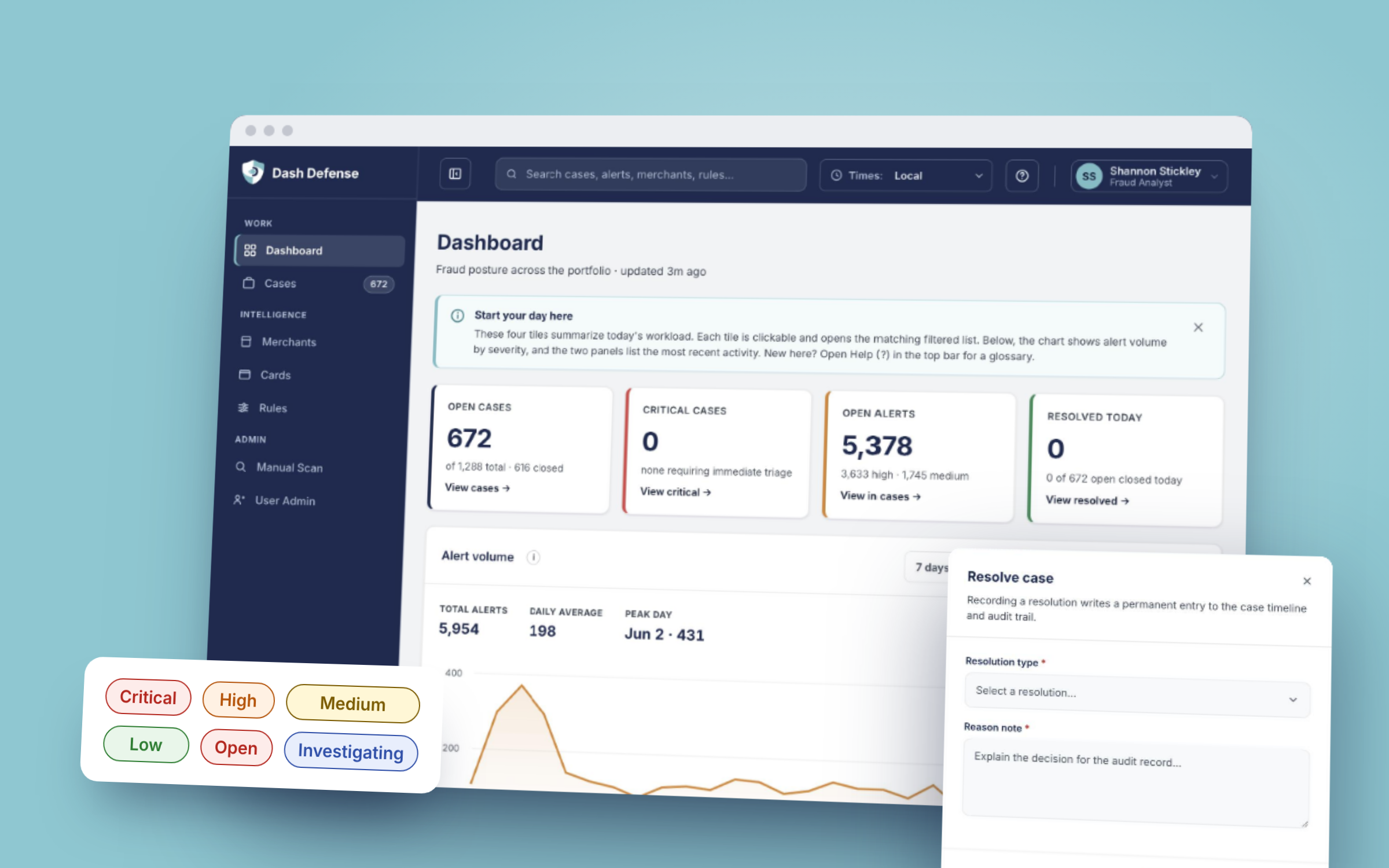
Dash Defense is the fraud case management platform we built in-house at Dash Solutions, a fintech company, to replace an outdated, outsourced fraud program. Our Fraud team uses it every day to triage alerts, investigate cards and merchants, adjust detection rules, and resolve cases across all of our digital products. When a case is resolved as fraud, a card gets blocked or a merchant gets restricted, so clarity really matters here.
The first version, the beta, was generated with AI from the baseline requirements. I stepped in to audit it and redesign the whole experience. The version in this case study is my redesign, and it is live today.
My Role
I'm the founding and sole UX/UI Designer at Dash Solutions, so I led and managed every aspect of the design myself, in close partnership with our VP of Product and Engineering Manager. Those roles included:
- UX Auditor: Audited all eight screens of the beta against usability heuristics and WCAG 2.2 AA, and prioritized every finding.
- Product Design: Redesigned the full analyst workflow, from dashboard and case queue to the case workspace, merchants, cards and rules, in light and dark themes.
- Design System: Built a tokenized badge and status system and updated all 5 Dash Solutions products to use it.
- User Researcher: Planned and ran usability tests, A/B tests, user interviews and design feedback sessions with the Fraud team, in person and virtually.
- AI Experience Design: Recommended the AI case summary, which became a product requirement, and defined it as a labeled, advisory feature with the analyst making every decision.
- Collaborator: Worked with the VP of Product and the Engineering Manager to align design with requirements, and reported to executive leadership.
- Prototyper: Built an interactive, coded prototype and used it to test real flows with users.
Tools
Figma for ideation, first designs and the badge system, a hand-built HTML/CSS/JS prototype, Microsoft Clarity, Jira and Confluence, the WebAIM Contrast Checker, and Claude.
The Problem
Our outsourced fraud program had a slow turnaround, gave the team limited control over detection rules, and was outdated. It simply could not keep up with all the new ways bad actors are using AI to try to get into our systems.
The beta that replaced it proved the data and the workflows could work, but it was built from requirements and not from the people using it. It was dark, dense, hard to read, and it had real accessibility gaps. The Fraud team needed a tool they could trust and work in all day.
UX Audit
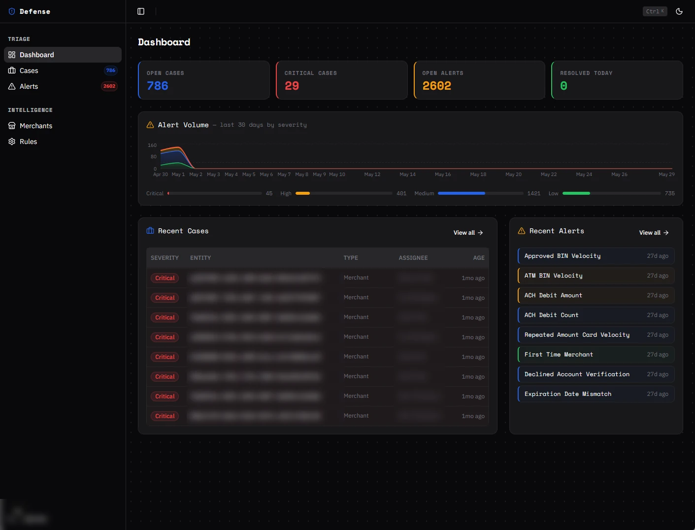
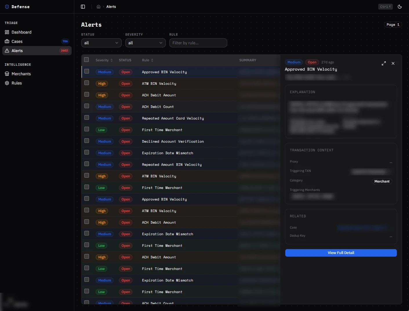
Before designing anything, I wanted a full understanding of what was and was not working. I audited all eight screens of the beta against usability heuristics and WCAG 2.2 AA, and prioritized every finding from P0 (fix before any rollout) to P2 (enhancement). The audit surfaced 18 accessibility findings.
A few of the biggest issues were that severity and status were shown by color alone, gray text on dark backgrounds was hard to read, icon buttons had no names for screen readers, raw system IDs were used as page titles, and resolving a case or turning off a rule took a single click with no reason recorded.
What stood out to me most was that almost every issue came from the same shared theme and the same handful of components. That meant I could fix each one once, in a shared design system, and improve all eight screens at the same time.
Audit findings and what shipped in the redesign
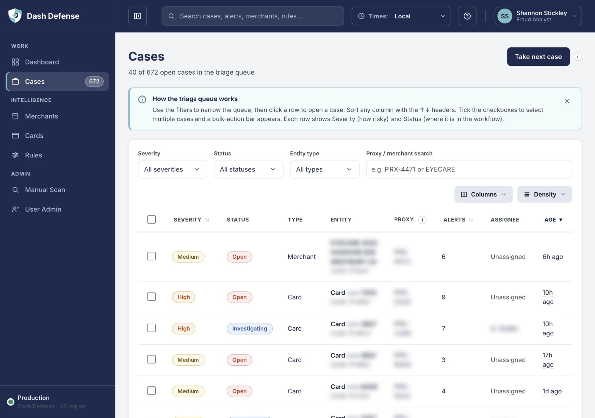
- Severity and status shown by color only: Text-labeled badges in two families, the same on every screen.
- Separate queues with no single worklist: One prioritized Cases queue with an entity-type filter.
- "Next case" button with an unclear effect: "Take next case", named for what it does.
- Fixed, dense tables: Column control and Compact, Comfortable or Spacious density, saved per user.
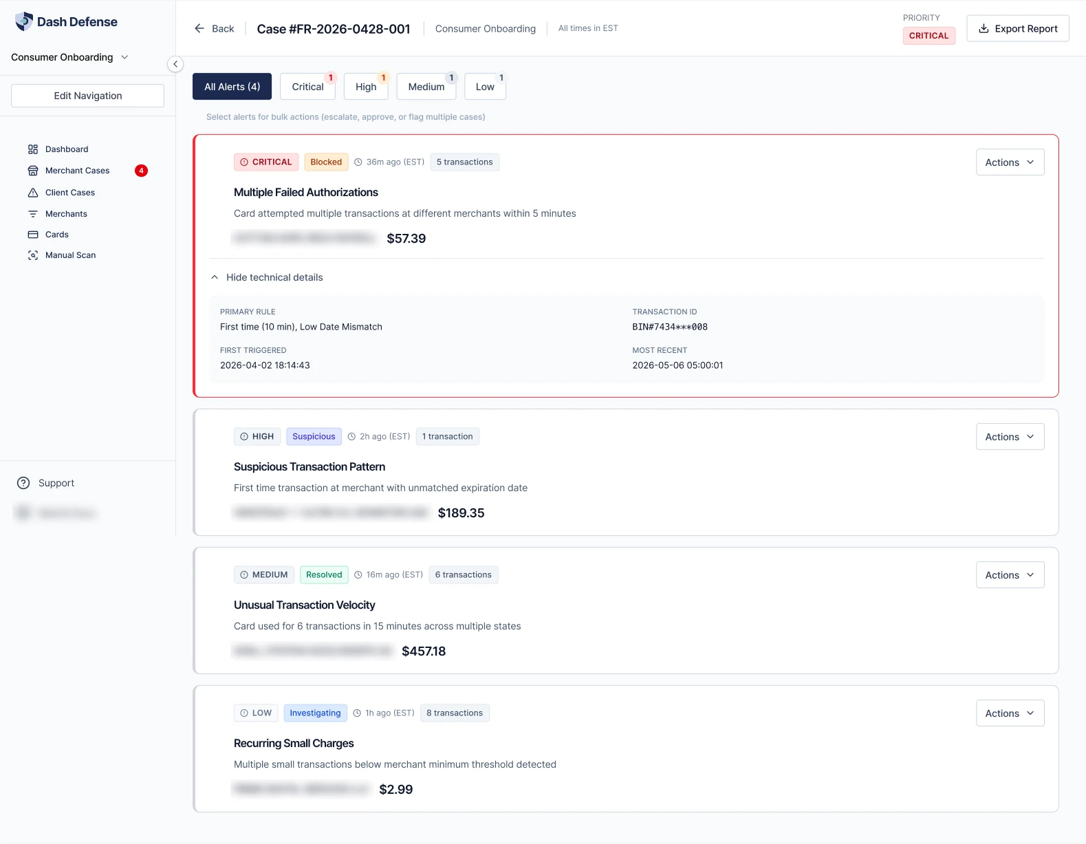
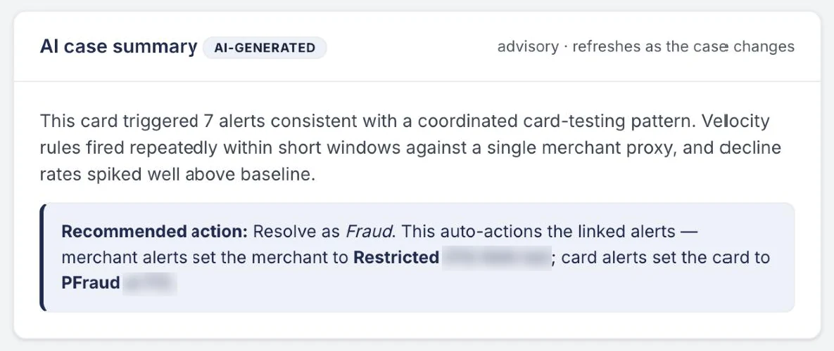
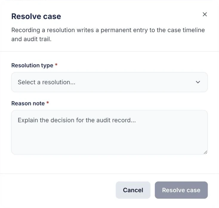
- Investigation spread across screens and tabs: One case workspace: risk strip, entity details, linked alerts, transactions, audit log.
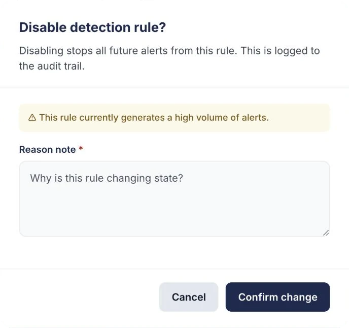
- One-click resolve and unguarded rule toggles: Confirmation, required reason and an audit entry on every consequential change.
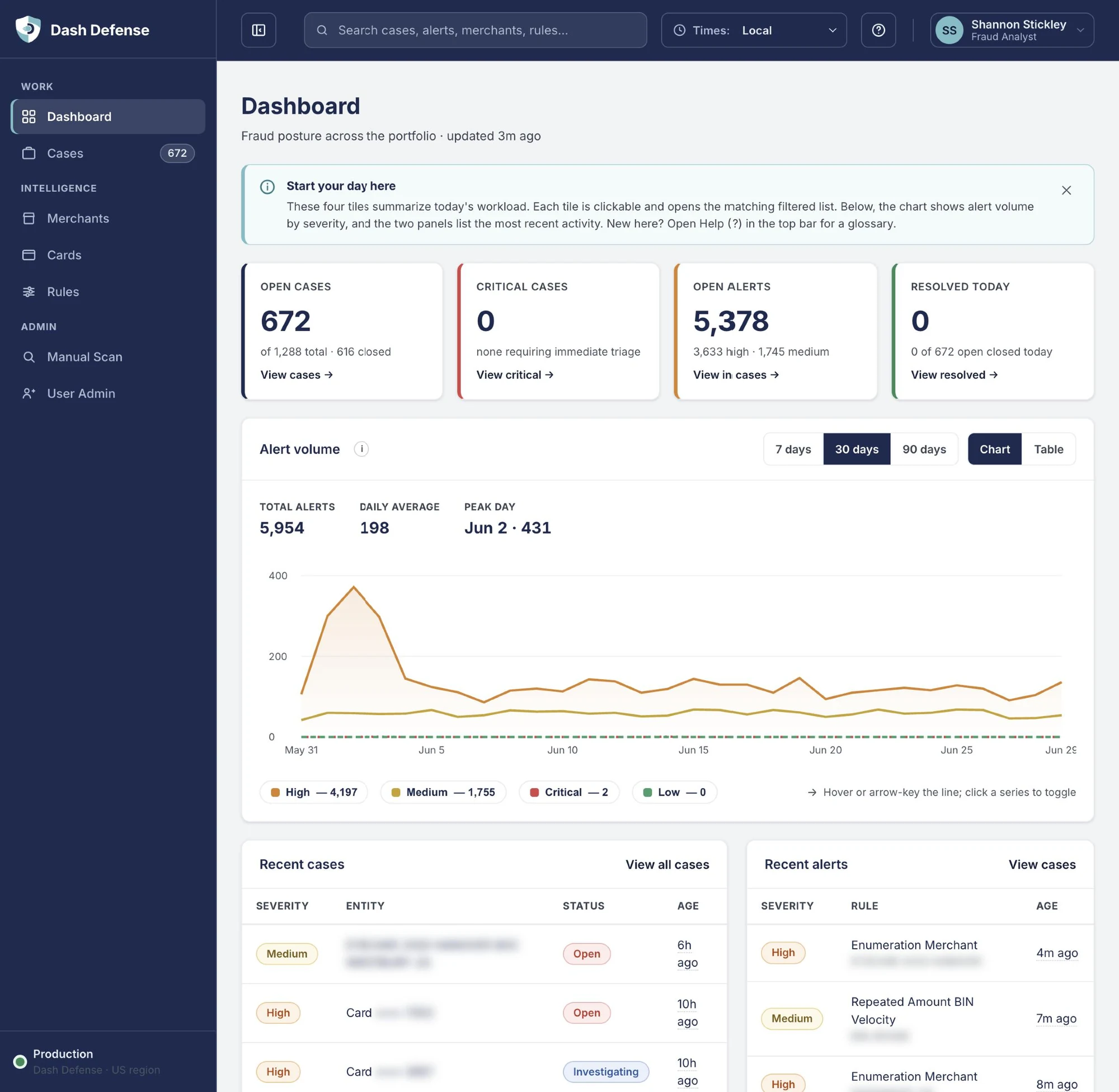
- Relative-only timestamps: Timezone selector, with the exact time on hover or focus.
- KPI tiles that did not read as clickable, no denominators: Tiles open the matching filtered list and show context such as "0 of 672 open closed today".
- Chart readable by color only: Legend with values, keyboard access and a table view.
- Bare category codes: Code plus plain-language category.
- Analysts kept notes in a separate Excel spreadsheet (found in testing): Notes and activity on every case, in the same audit log as each decision.
- No AI assistance or explanation: Labeled, advisory AI case summary with a recommended action.
User Research
Getting feedback from the people who use the product is incredibly important to me. I ran usability tests, A/B tests, user interviews, and design feedback sessions with our Fraud team, both in person and virtually, using an interactive prototype. Three primary fraud analysts tested the product with me, and I also met with the entire team of eight.
This was the Fraud team's first time being part of usability testing, A/B testing, user interviews, and design feedback. They were helping build a tool they would actually need, and they had a lot to share.
User Interviews
The primary goal of the interviews was to uncover where the team was losing time or carrying extra mental load. Two things came up that shaped the product.
First, the team mentioned they take lots of notes and comments in an Excel spreadsheet while working cases. I suggested adding a notes section within Dash Defense to help reduce that cognitive overload, so the notes live with the case and nobody has to switch tools.
Second, they loved the idea of machine learning helping to quickly summarize a case for them. I had highly recommended adding an AI case summary. Our VP of Product had not thought of that, and decided to build it into the product requirements.
“We were used to the old, clunky way of working. Dash Defense feels easier and is going to save us time.”
Dash Solutions Fraud team
Ideation & First Designs
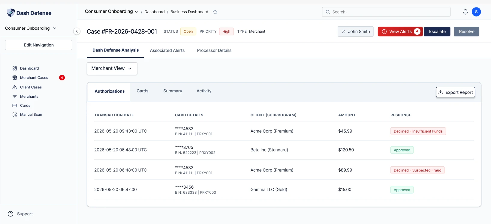
With the audit complete, I moved into Figma to sketch, design, and explore. My first designs focused on getting the structure right before the details. One early direction organized a case into tabs, and another explored showing alerts as cards with the technical details tucked behind a toggle. These helped me work toward the final design, where everything for a case lives in one workspace.
A/B Testing
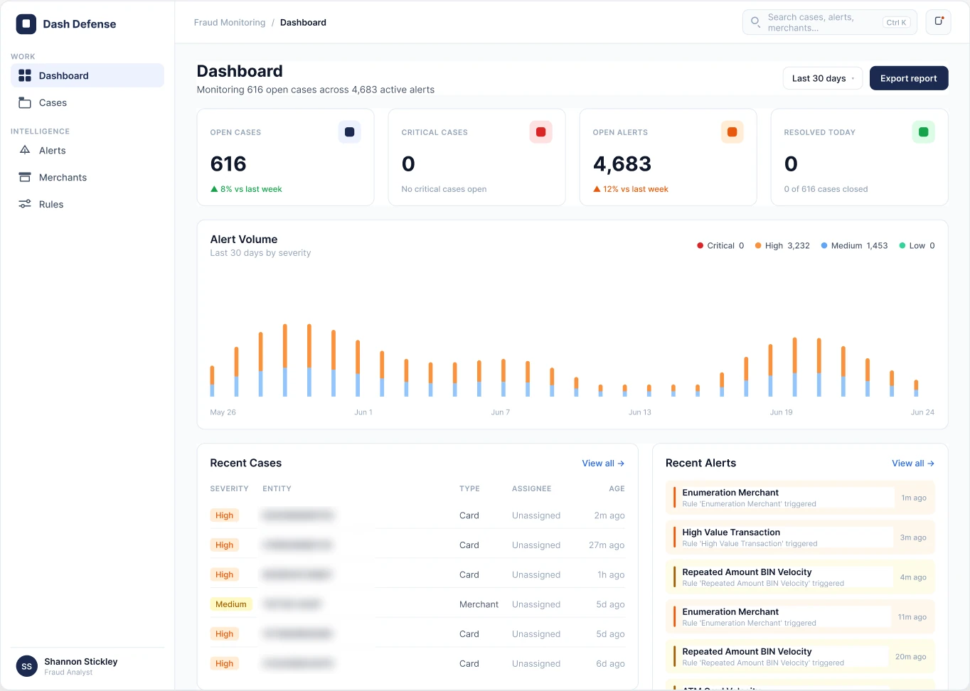
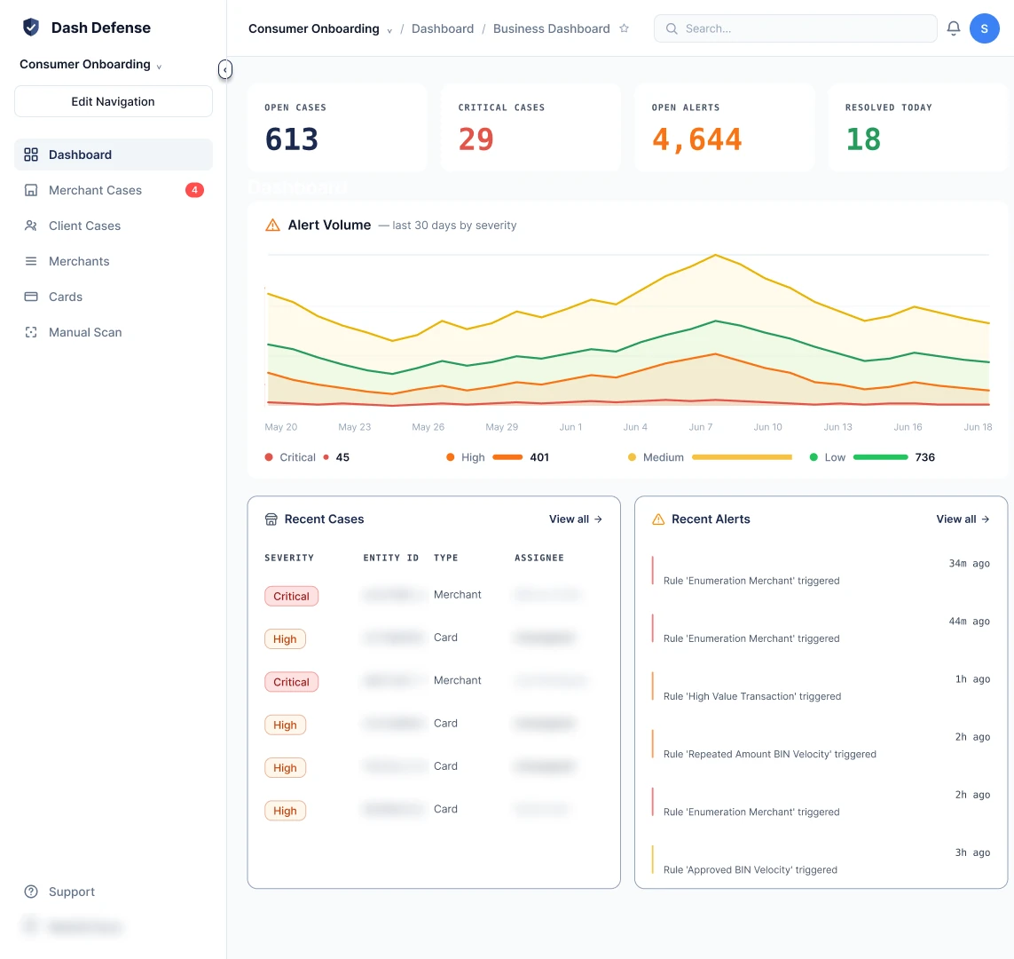
I designed two versions of the dashboard, Dashboard A and Dashboard B, and tested both with the Fraud team. Users liked Option B. They said it felt less overwhelming to read the important data. Option B makes the four key numbers larger and color-codes each one, so the eye goes straight to what matters before anything else on the screen.
I used Option B to move in the direction of what was finalized in the prototype, and that UI is now live.
The Solution
With the research and testing behind me, I aimed to give our Fraud team one clear place to do their work by redesigning Dash Defense around how they actually triage, investigate, and decide. That meant one prioritized case queue, one workspace for each case, a shared badge and status system, an AI case summary that advises but never decides, confirmation and a reason on every high-stakes action, and accessibility built in from the start in both light and dark themes.
Why a Designer in the Age of AI
AI built the beta quickly, and that speed was valuable. But AI built what was asked for in the requirements. It had never met our Fraud team, and it did not know they were keeping notes in a spreadsheet or which actions should make someone slow down and think.
That is where I come in. I use AI where it adds value by speeding up ideation, exploring concepts, and reducing repetitive work. I also used Claude to audit my designs for accessibility, since as the only designer I do not have another designer to review my work. But I rely on human discernment, judgment, empathy, accessibility, and business strategy to shape every final UX and UI decision.
How a Case Moves Through Dash Defense
To make sure I was designing for the right moment, I mapped how a transaction becomes a decision. Most of the steps are automated. The step where an analyst decides is the only place a person touches the system, so that is where I focused.
- Transactions arrive: Card activity streams in from the processor in real time.
- Rules evaluate: Detection rules check each event against thresholds and time windows.
- Alerts become cases: Related alerts are grouped and placed in a prioritized queue.
- An analyst decides (where I designed): Queue, case detail, rules, cards and merchants. The human step.
- Action is taken: The decision goes back to the processor: block a card, restrict a merchant.
Badges & Status System
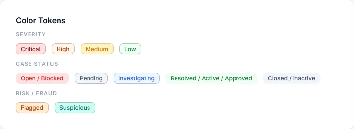
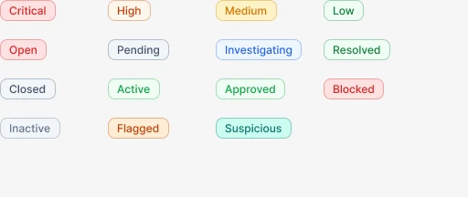
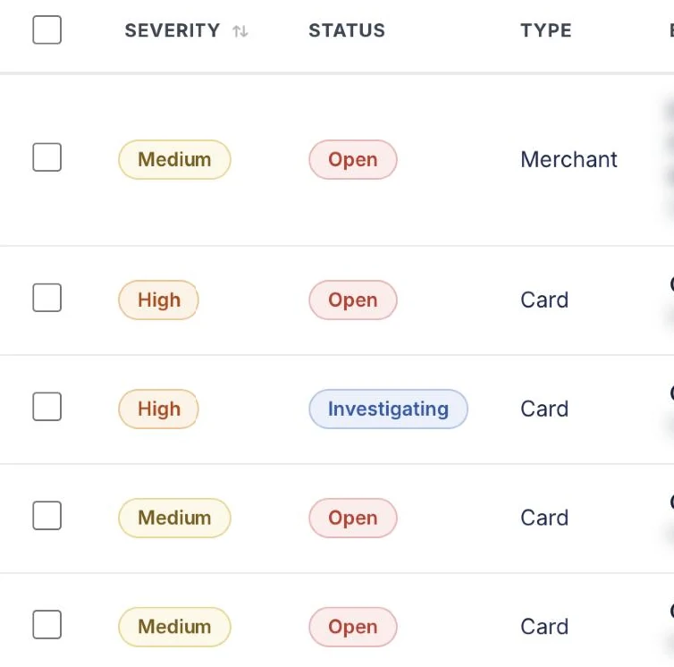
I created a badge and status label system so that every screen describes a case the same way. Severity (Critical, High, Medium, Low) tells the analyst how risky something is, and Status (Open, Investigating, Resolved) tells them where it is in the workflow. They always sit side by side, and the same style carries over to card and merchant statuses.
I documented the badge in Figma with its color tokens and every variant, using tinted backgrounds with semantic text colors for WCAG AA compliance and low alarm fatigue in dense data tables.
I built the system in my own Playground file in Figma and rolled it out from there. It is net new for the company, and I have updated all five of our products to use it.
Trade-off: Showing two badges on every row takes up more space in a dense table. I kept both and gave analysts column and density controls, so they never have to guess whether a label means how risky or how far along.
Accessibility
I treated accessibility as a requirement from day one and designed to WCAG 2.2 AA, using the W3C WCAG guidelines and the WebAIM Contrast Checker to check my color pairings. Every badge has a written label, so nobody has to rely on color to understand it. All badge labels pass the 4.5:1 contrast requirement in both light and dark themes, body text sits at about 15.9:1, and every control works with a keyboard and has a visible focus ring.
Trade-off: Some colors I liked did not pass the contrast check, so I cut them. The palette is smaller than the one I started with, but it is accessible and easier to keep consistent across products.
AI Case Summary
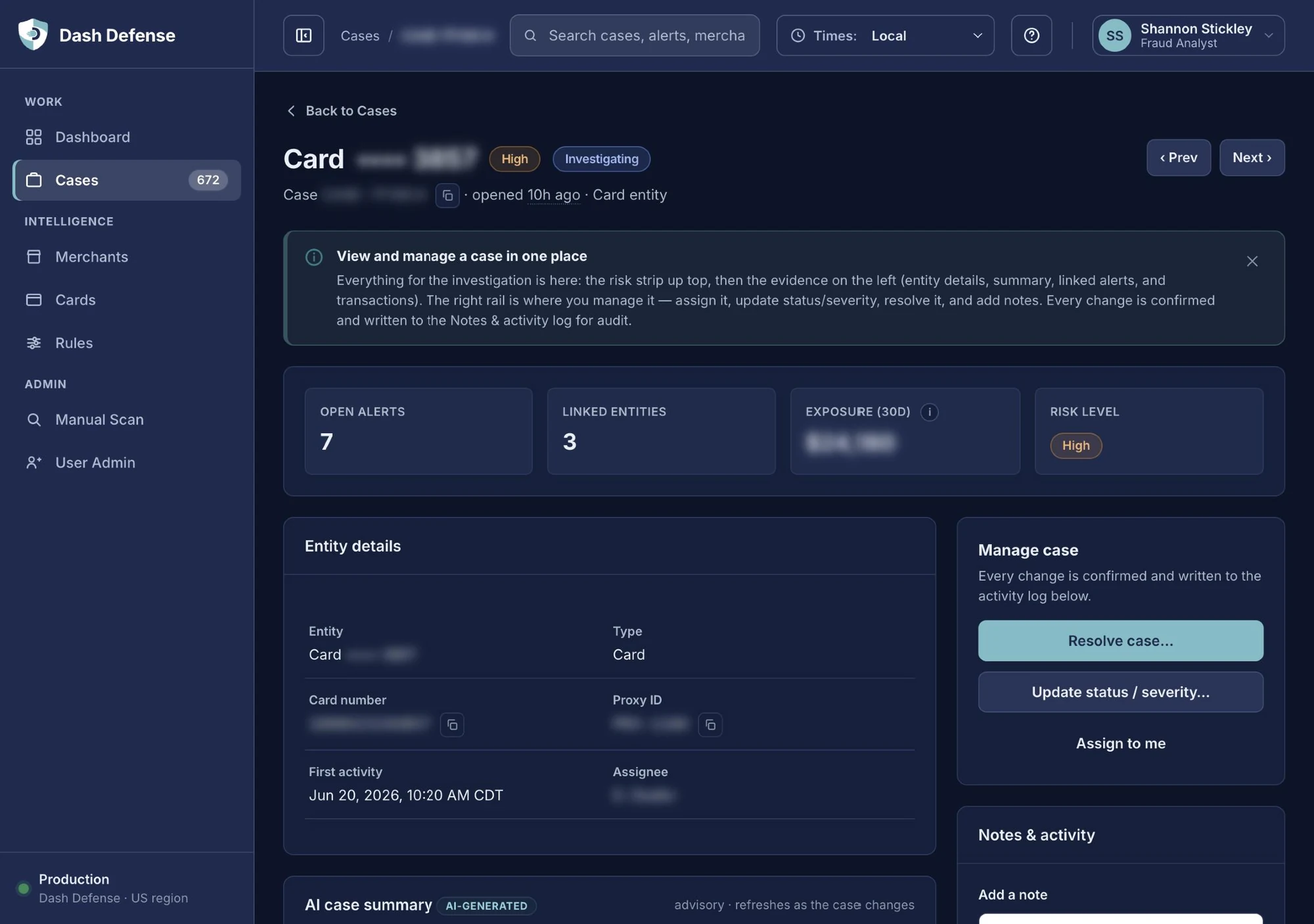
Each case opens with a short AI summary explaining why the alerts were grouped together, along with a recommended action. I designed it to be clearly labeled as AI-generated and advisory. It explains what will happen if the analyst follows the recommendation, but it never takes action on its own. The analyst always makes the final call.
Trade-off: A one-click button to accept the AI's recommendation would have been faster. In fraud work a wrong decision affects a real cardholder, so I chose the slower path where a person decides and records why.
Confirming High-Stakes Actions
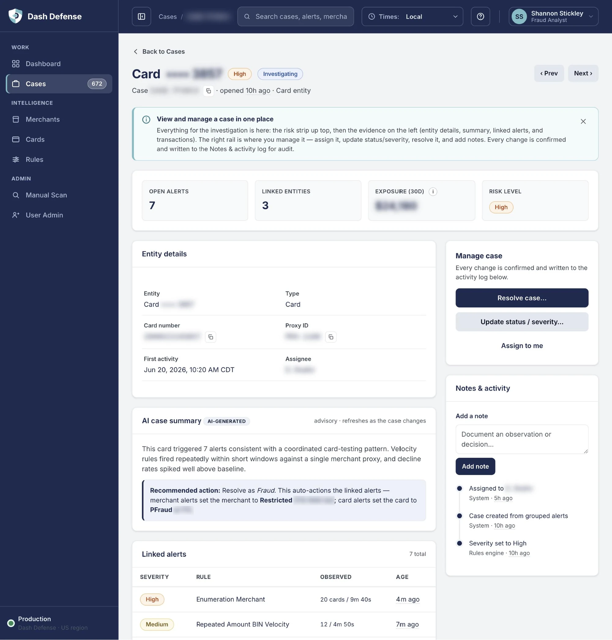
Resolving a case or turning off a detection rule changes what happens next for a real cardholder or merchant. For these actions I added a confirmation step that explains the effect in plain language, asks for a reason, and writes it to the audit trail. Everyday actions like assigning a case or adding a note stay quick.
Trade-off: Asking for a reason adds a few seconds to every resolution. I only added that step where a mistake is expensive, and kept everything else fast.
Collaboration & Handoff
I collaborated closely with our VP of Product and Engineering Manager throughout the project, and shared updates with executive leadership. For handoff, I shared the final prototype along with my documentation from the audits and my review of 2026 best practices, so engineering had both the design and the reasoning behind it.
Outcomes
- Dash Defense Phase 1 is live and replaced our outsourced fraud program.
- All 18 accessibility findings from my audit are fixed. All badge labels are at or above 4.5:1 contrast in both themes.
- All 5 Dash Solutions products now use the badge and status system.
- The Fraud team's Excel spreadsheet is retired. Notes now live inside Dash Defense.
- The AI case summary I recommended became a product requirement.
- I tested with our 3 primary fraud analysts and met with the entire team of 8.
- Time to triage a case is not yet measured. Setting this baseline is planned for the next version.
What's Next
This case study covers Phase 1. We are starting on the next phases now, with Phase 2 going live in 2027. I am collaborating with our VP of Product on what comes next for the analyst experience.
- Phase 1 (live): Replace the outsourced program. A real-time platform at full parity with the old program: rules engine, alerts and cases, analyst workflow, reporting.
- Phase 1B (next): Bolster the data. Bring in chargeback and dispute outcomes and tie each one to its original transaction, so resolved cases become labeled fraud data.
- Phase 2 (starts late 2026, live 2027): Build the future. Link analysis to find fraud rings, trust and block lists, new non-payment signals such as phone and verification events, and the groundwork for machine learning models and account-takeover defense.
Reflection
This project taught me a lot about what design brings to a product in the age of AI. AI helped us move quickly, but it took sitting down with our Fraud team to learn what they actually needed. The notes section and the AI case summary both came from listening to them.
As the founding and sole designer, I lead and build the design for all five of Dash Solutions' digital products. That has pushed me to build systems that scale, to document my decisions clearly, and to use AI as a second set of eyes while keeping the final judgment my own.
If I could do one thing differently, I would start measuring how long it takes to triage a case from the very first round of testing, so we have a baseline to compare against in the next version.